

Power of Typography: Shaping Perceptions
Typography is one of the most powerful tools in a designer’s toolkit. Zoos, aquariums, museums, parks, and conservation organizations use typography strategically to shape the visitor experience and move their mission forward.
More than just making words readable, great typography expresses personality, sets the mood, and strengthens a brand’s identity. It can instantly make a design feel playful, elegant, scientific, adventurous, welcoming, or bold, even before anyone reads the message.
In this article, we’re taking a closer look at how typography can change the perception of a design. Using the same image, color palette, layout, and messaging, we altered only the typeface to demonstrate how a single design choice can influence a piece's overall feeling.
Typeface vs. Font: What’s the Difference?
Before we dive in, let’s clear up a common misconception. A typeface is the overall design family of letters, numbers, and symbols. A font is a specific style or variation within that family. For example, Arial is a typeface. Arial Regular, Arial Bold, Arial Italic, and Arial Bold Italic are font siblings within that typeface family.
How Typography Shapes Perception
When creating a poster, exhibit graphic, social media campaign, or interpretive sign, typography does more than display information. It helps audiences understand the content:
A playful typeface can create a sense of curiosity, warmth, and family-friendly fun.
A refined serif typeface may communicate elegance, tradition, or sophistication.
A bold sans-serif typeface often feels modern, confident, and approachable.
The example below illustrates this concept. While the imagery, colors, messaging, and layout remain nearly identical, changing the typeface significantly alters the overall tone of the design.
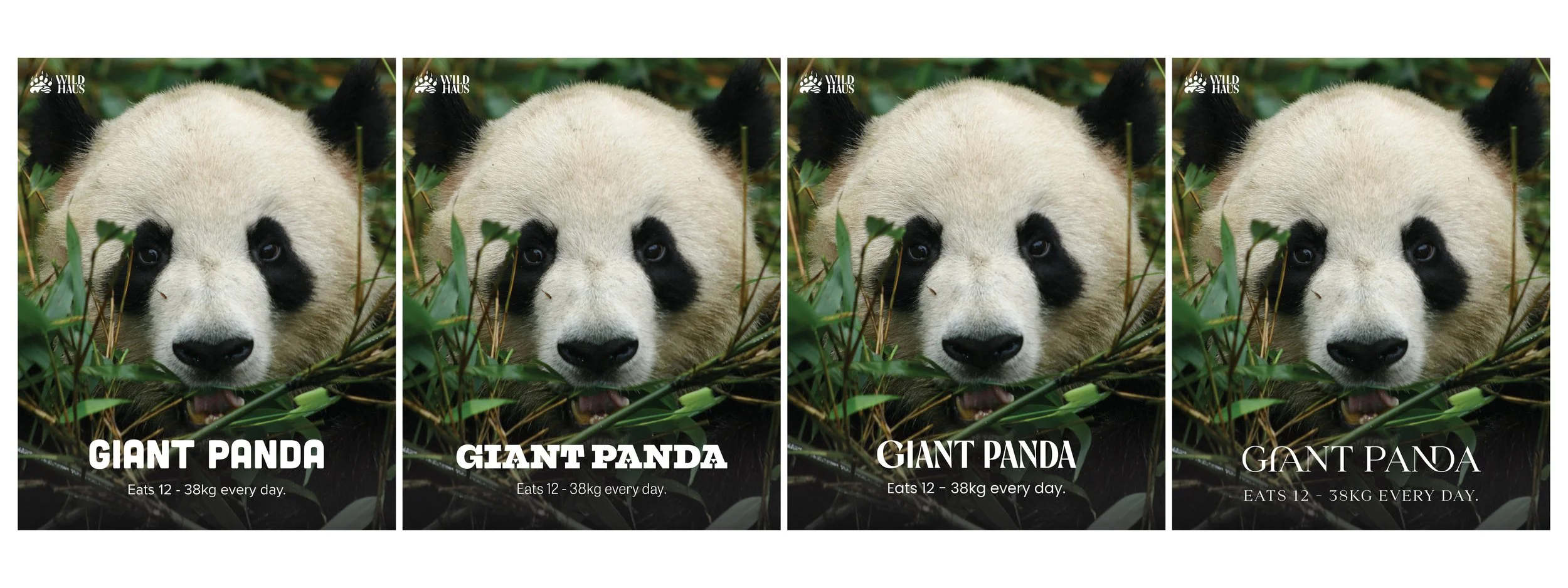
Image of four panda posters that all have the same message but created using different fonts to change the overall tone of the design.
Typography in Zoos, Aquariums, and Interpretive Spaces
In shaping visitor experience, an organization maintains a consistent brand typeface across its core communications while introducing complementary typefaces for specific exhibits, zones, campaigns, or seasonal events. This allows each experience to have its own visual identity while still connected to the larger brand.
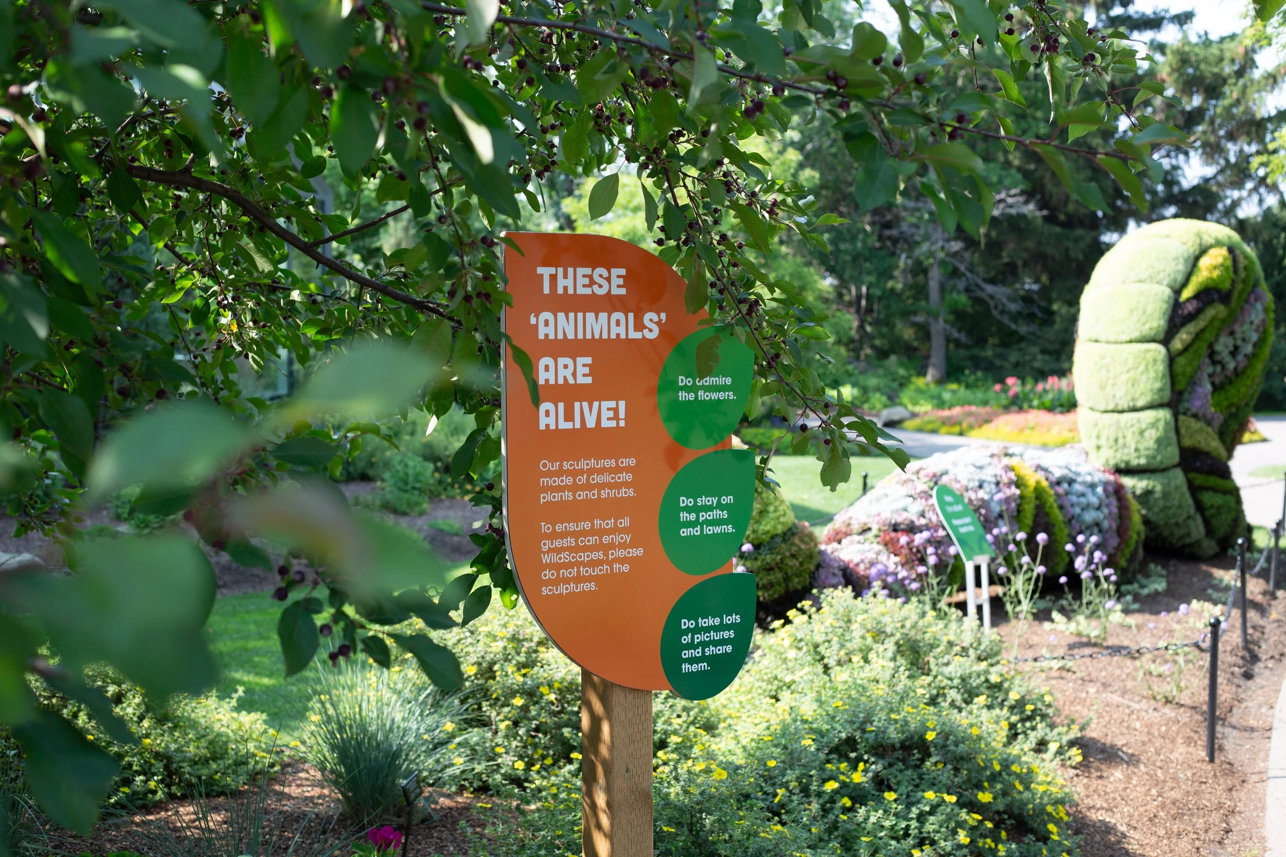
In interpretive signage, typography can support storytelling. The right typeface can help visitors understand whether content is scientific, playful, historical, adventurous, emotional, or conservation-focused before they read the first sentence. This is especially important in spaces where visitors are moving quickly, scanning information, or engaging with content alongside children, families, school groups, or first-time guests.
Next steps
Now that you understand how typography can impact design, the next step is learning how to use it. Scale, spacing, weight, hierarchy, and color all influence how type is seen, felt, and understood. When these elements work together, typography becomes more than readable text. It becomes a tool for guiding attention, creating emotion, and shaping the overall experience, helping move your mission forward.
Have a Project?
Wildhaus Creative partners with zoos, aquariums, parks, and conservation organizations to create engaging visual communications that connect audiences to our wild world.
Whether you’re developing an exhibit, interpretive signage, campaign, or brand experience, Wildhaus Creative will help bring your story to life through strategic design.
Ready to get wild? Email hello@wearewildhaus.com to start the conservation
